![]()
What makes up a web page? Even the most basic require at least a few headings, paragraphs, and images and maybe a navigation bar, sidebar, and footer.
If it’s your page, you not only want to organize and display these elements effectively — you also want to ensure they look good on any screen, from desktops to mobile devices and all the devices in between.
Previously, site owners had to “hack” their CSS, using table elements, in-line blocks, floats, and different positioning types. Creating some complex layouts required JavaScript as well.
Together, these techniques were somewhat effective, but lacking in power. They were not only missing some key functionality, like vertical centering, which made it frustrating to get them to work across browsers. They also made the code of a site much more difficult to maintain.
To simplify both the creation and maintenance of web pages, responsive layout models were created. Among the most popular are Flexbox, CSS Grid, and Bootstrap, each of which is widely supported across platforms and browsers.
In this post, we’ll take a closer look at each model, explaining its key differences and ideal use cases.
CSS Grid vs. Flexbox
CSS Grid and Flexbox are layout models that share similarities and can be used together. The key difference is that CSS Grid can be used to create two-dimensional layouts, while Flexbox can only be used to create one-dimensional layouts. That means you can place components along the X- and Y-axis in CSS Grid and only one axis in Flexbox.
You might be thinking that’s too much math, so we’ll walk through each model below.
Let’s start with CSS Grid. With CSS Grid, you can align components into columns and rows. This makes it ideal for larger layouts that need to be divided into sections. In other words, this type of layout will have elements that need to overlap and layer, rather than be linear.
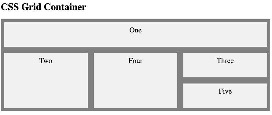
Below is a helpful illustration of a layout that’s possible with CSS Grid.

With Flexbox, you can lay out and align elements in a container even if you don’t know the size of those elements or if the size might change. That’s because a flex container is flexible: it expands the flex elements to fill space when it’s available and shrinks them to prevent overflow when it’s not.
Below is another helpful illustration that shows a layout that’s possible with Flexbox.

Like Flexbox, CSS Grid can be used to create one-dimensional layouts (and often is). Flexbox can also be used to create two-dimensional layouts. So it would not be correct to say the major difference is the CSS Grid is exclusively for two-dimensional layouts, and Flexbox is for one. It’s just that CSS Grid allows you to create 2D layouts in ways that Flexbox does not.
With Flexbox, you can create multi-line flex containers. You simply have to apply the flex-wrap property with a value of “wrap” to your container. That way, if your items are too large to all display in one line on a particular viewport, they will wrap onto another line rather than shrink to fit onto one row.
This will create rows and columns in a sense. But how wrapped flex items line up on a row will be independent of how they lined up on the previous row. That’s because you can’t control where flex elements end up like you can in CSS Grid; flex elements simply inch along a single axis and then wrap accordingly. The layout will look more like bricks than a grid as a result.
Here’s a side-by-side comparison of a layout built with Flexbox and one built with CSS Grid that shows this effect.

Before we move on to the next comparison, it’s important to understand that these layout models are not mutually exclusive. You can combine them by using a Flexbox container inside a CSS Grid container. Note, however, that you cannot use a CSS Grid Container inside a Flexbox container.
Flexbox vs. Bootstrap
To kick off this comparison, it’s important to understand that Bootstrap 4’s grid system is built with Flexbox. What sets Bootstrap apart from using Flexbox alone is the process of writing the actual code. With Bootstrap, you can create a grid using only HTML. With Flexbox, you must use HTML and CSS. Let’s take a closer look at each process below.
Bootstrap offers a twelve column system, five default responsive tiers, Sass variables and mixins, and dozens of predefined classes. That means you can use its mobile-first flexbox grid to build unique and complex layouts without having to build them from scratch — it also means you need to understand its unique syntax.
Let’s start with its column system. Bootstrap has a twelve-column system, which means that there can be up to 12 grid columns on a single horizontal block. You can have more than 12, they’ll just start to wrap rather than display on a single axis, regardless of the viewport.
Most site owners won’t need more than 12 columns or even close to 12. In that case, you just need your columns to add up to twelve so they display on a single horizontal block. That means if I want to create two columns, in which one is half the size of the other, I’d use the classes .col-4 and .col-8.
Now let’s say I want to create equal-width columns that display horizontally until they reach a certain screen width and then automatically stack on top of each other. In that case, I’d need to use a responsive grid breakpoint.
The five default responsive tiers of the Bootstrap 4 grid system are listed below. Please note that the value listed in pixels is the breakpoint at which columns will automatically stack on top of each other.
| CLASS PREFIX | DEVICE SIZE | MAX CONTAINER WIDTH |
| .col- | extra small devices | less than 576px |
| .col-sm- | small devices | equal to or greater than 576px |
| .col-md- | medium devices | equal to or greater than 768px |
| .col-lg- | large devices | equal to or greater than 992px |
| .col-xl- | extra-large devices | equal to or greater than 1200px |
Because the column system and responsive tiers work together, you’ll often see a number and a prefix defining the .col class. We’ll see that in the example below.
Bootstrap Grid Example
Let’s say I wanted to create six equal-width columns that stacked on top of each other on mobile phones or screens that are less than 576px wide. To do, I’d use the .col-sm-2 class.
Applying this class to six <div> elements, I’d then wrap these in a row, as shown below.
<div class="row">
<div class="col-sm-2" style="background-color:lavender;">.col-sm-2</div>
<div class="col-sm-2" style="background-color:lavenderblush;">.col-sm-2</div>
<div class="col-sm-2" style="background-color:lavender;">.col-sm-2</div>
<div class="col-sm-2" style="background-color:lavenderblush;">.col-sm-2</div>
<div class="col-sm-2" style="background-color:lavender;">.col-sm-2</div>
<div class="col-sm-2" style="background-color:lavenderblush;">.col-sm-2</div>
</div>
</div>
You’ll see I added some inline CSS styling to more clearly see each individual column on the front-end. Here’s the result:

Now we’ll walk through an example of building a grid in Flexbox so you can compare the process with each.
Flexbox Grid Example
Let’s say I want to create a flexbox grid with six columns, like the one above. In the body section of the page, I’d simply create six <div> elements and wrap them in a <div> element with the .flex-container class. Here’s the HTML:
<div class="flex-container">
<div>1</div>
<div>2</div>
<div>3</div>
<div>4</div>
<div>5</div>
<div>6</div>
</div>
I’d then add CSS to the head section of my page.
Using the CSS selector .flex-container, I’d actually make the container flexible by setting the display property to flex. I can then specify the height of the container as well as the background color, as shown below.
.flex-container {
display: flex;
height: 250px;
background-color: gray;
}
To style the flex items within the container, I’d use the selector .flex-container > div. I can then set the background color, width, margin, and font-size of each item. I can also use the text-align property to set the alignment of font within each item and the line-height property to set how far from the top of the flex container the font will be displayed. Here’s that CSS:
.flex-container > div {background-color: #f1f1f1;
width: 100px;
margin: 10px;
text-align: center;
line-height: 60px;
font-size: 48px;
}
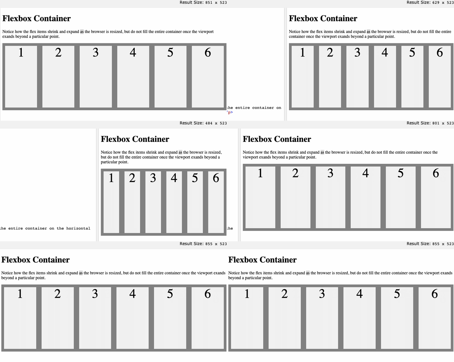
Here’s the result:

If I want the flex items to fill up the entire container, no matter how the viewport changes size, then I can simply add the flex-basis property in my CSS. Let’s set it to 1 1 150px so that the items grow and shrink from a flex-basis of 150 pixels. Here’s the new CSS:
.flex-container {
display: flex;
height: 250px;
background-color: gray;
}

.flex-container > div {
background-color: #f1f1f1;
width: 100px;
margin: 10px;
text-align: center;
line-height: 50px;
font-size: 48px;
flex: 1 1 150px;
}
Here’s the result:

Additional flex item properties are order, flex-grow, flex-shrink, flex-basis, and align-self. You can learn more about them in A Complete Guide to Flexbox on CSS Tricks.
CSS Grid vs. Bootstrap
Now that we’ve compared CSS Grid vs. Flexbox and Flexbox vs. Bootstrap, let’s compare CSS Grid and Bootstrap.
If trying to decide which of these two layout models to use, ask yourself whether you have your layout structure nailed down or the content. If you’re layout-first, meaning you want to create the layout and then place items into it, then you’ll be better off with CSS Grid. But if you’re content-first, meaning you have items that you want to place into a container and space out evenly, then go with Bootstrap. Since Bootstrap is built with Flexbox, you can apply this reasoning when comparing CSS Grid vs. Flexbox as well.
Now let’s take a look at the code of specific examples of grids that can be built with CSS Grid and Bootstrap respectively.
CSS Grid Example
Creating a grid container is simple. You simply have to apply the display property to an element and set the value to grid or inline-grid. Styling it is where it gets tricky.
Let’s say I want to create a layout with five items. Here’s the HTML I’d start with:
<div class="wrapper">
<div class="box1">One</div>
<div class="box2">Two</div>
<div class="box3">Three</div>
<div class="box4">Four</div>
<div class="box5">Five</div>
</div>
Then I’d make it a grid container and change its background color to gray with this CSS:
.wrapper {
display: grid;
background-color: gray;
}
Now let’s say I want to create three equal-width column tracks. You can use the grid-template-columns and grid-template-rows properties to define the rows and columns on your grid and their size (or you can just define one). I can use any length unit, but I’ll use the fr unit. The fr unit represents a fraction of the available space in the grid container rather than a set amount, and ensures that grid tracks grow and shrink according to the available space. The CSS for my example would now look like:
.wrapper {
display: grid;
background-color: gray;
grid-template-columns: 1fr, 1fr, 1fr;
}
Notice that we used the grid-template-columns property to explicitly define the columns on our grid, but we did not use the grid-template-rows properties to explicitly define rows. That does not mean your CSS grid has no rows; it just means that rows are defined implicitly. You can set the size for tracks created in the implicit grid with the grid-auto-rows and grid-auto-columns properties.
Let’s say I want to ensure that tracks created in my implicit grid are 100 pixels tall. Then I’d add the following CSS so the final result would be:
.wrapper {
display: grid;
background-color: gray;
grid-template-columns: 1fr, 1fr, 1fr;
grid-auto-rows: 100px;
}
Finally, I need to place the five items within the grid container. With CSS Grid, you use the grid-column-start, grid-column-end, grid-row-start, and grid-row-end properties and set the value to different grid lines. Grid lines are basically the horizontal and vertical dividers of child items in a grid. The grid lines of this three-column, two-row grid, for example, are numbered below:

So if I want my box1 to span from the far-left line on the grid to the far-right, then I’d place it against column line 1 and span it to column line 4. And if I wanted it to span one implicit row track, then I’d begin it at row line 1 and end it at row line 2, as shown below. I also have CSS to style box2 and box4.
.box1 {
grid-column-start: 1;
grid-column-end: 4;
grid-row-start: 1;
grid-row-end: 2;
}

.box2 {
grid-column-start: 1;
grid-row-start: 2;
grid-row-end: 4;
}
.box4 {
grid-column-start: 2;
grid-row-start: 2;
grid-row-end: 4;
}
The result would be:

You can click the source link to see what CSS I used to style the grid items. It’s from the Flexbox example above.
Bootstrap Grid System
Now let’s say I want to make a row with two columns, one that’s full-width and one that’s half-width so they stack on top of each other on mobile. Here’s the HTML:
<div class="row">
<div class="col-md-8" style="background-color:yellow;">.col-md-8</div>
<div class="col-6 col-md-4" style="background-color:lightyellow;">.col-6 .col-md-4</div>
</div>
I want to make another row with three columns that take up 1/2 of the viewport on mobile and 1/3 on desktop. Then I’d use the following:
<div class="row">
<div class="col-6 col-md-4" style="background-color:lightblue;">.col-6 .col-md-4</div>
<div class="col-6 col-md-4" style="background-color:blue;">.col-6 .col-md-4</div>
<div class="col-6 col-md-4" style="background-color:navy;">.col-6 .col-md-4</div>
</div>
Finally, I want to make one last row with two columns that are always 50% wide, no matter what the screen size. Then I’d use the following HTML:
<div class="row"><div class="col-6" style="background-color:lightgreen;">.col-6</div>
<div class="col-6" style="background-color:green;">.col-6</div>
</div>
</div>
All together, this is the result:

Creating Unique Layouts
Flexbox, CSS Grid, and Bootstrap are responsive layout models that enable you to create responsive and unique layouts that work across many different browsers and devices. No matter which model you choose, you’ll need some familiarity with HTML and CSS.


